
Your shopping cart is currently empty.
Free EmbroideryClick Here
FREE shipping on orders over $249*
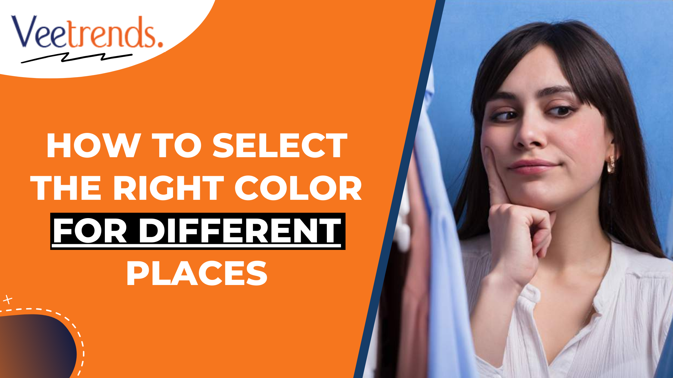
Color is one of the most powerful tools for influencing emotions and behavior. It can help us feel strong and confident, energized or calm. The right color choice can affect how others perceive us as well! This post will explore the psychology behind color selection in different environments and how it affects our moods, perceptions, buying behavior, and brand perception.
Color psychology is a branch of behavioral science that studies the impact of color in both tangible and intangible environments. It involves how colors affect moods and perceptions, emotions, behavior, memory, attention, creativity, and more.
There are many ways to use color psychology.
You can use it to help you choose the right colors for your home & office wear.
You can learn about how certain colors affect people's feelings so that you can make better decisions about what kind of clothes to wear or where to buy furniture from.
You may be wondering what all this has to do with color psychology. The answer is everything! Color is a powerful tool that can help you influence people's behavior and perception of brands, products, and more.
When it comes to color psychology, there are two main categories: 1) the use of color in branding (i.e., what colors you use on your website or business card), and 2) how we perceive different colors depending on their context (for example: if someone wears blue jeans inside but then wears black pants outside).
Color is a powerful symbol to express emotion, culture, religion, and gender. In different cultures worldwide, color has different meanings, and it's important to be aware of these meanings when you choose your clothes.
Color is also utilized as a tool for communicating nationality. For example, if you're from India, your clothing should reflect this fact by using reds and pinks, which are associated with Indian culture.
Colors also have a cultural significance. Colors represent various cultures, religions, and historical periods. The use of colors in different cultures is often based on each group's importance to certain colors. This can be seen in how people worship the same god but choose different colors for their temples or costumes when they engage in religious rituals.
Some examples of this include:
Hindus consider red sacred because it represents life energy; its symbolism dates back thousands of years!
In Christianity, blue has long been associated with heaven, while green means earth; together, they make up one color called "the holy trinity" (blue/green/yellow).
Here are some easiest ways to protect the colors of your t-shirts.
Im sure everyone wants to know how to age a shirt, but nobody knows how. So here is our guide on age diy vintage t-shirts without damage.
A few people know how to wash and care for polyester. For those who look up for a quick and easy way to check out the steps to wash and care for polyester.
Are you deliberating, waiting to know how to make a stiff T-shirt soft? How to soften T-shirt. No need to browse more; you're on the right page. Learn from our DIY Guide.
Removing stains from the white colors of clothing was daunting. But with our secret recipe, you can gently remove stains from your clothing. So, if you want to know How to Acid Wash a T-shirt, click on the guide How to Acid Wash a T-shirt.
Color is one of the most important elements in a room, but it's also one of the hardest elements to get right. You might think that if you just create a color scheme and stick with it, your room will be perfect, but in reality, many other factors influence how people perceive your space.
Color can influence moods and feelings:
Blue is calming, while red makes people feel excited or angry (depending on what context).
Green makes people feel relaxed; yellow invites optimism; purple brings out creativity and imagination.
Colors are a significant element in design and ambiance creation because they evoke feelings, set moods, and improve aesthetics in indoor and outdoor settings.
Designers can use the concepts of color theory to create visually pleasing and relaxing environments by considering the interplay between various hues. Complementary colors add energy and contrast, while corresponding hues foster calm and harmony. To create a harmonious and cohesive aesthetic, it's important to have a firm grasp of color temperature and value.
Think about the mood and purpose of a room before deciding on paint colors. Choose warm colors like neutrals and earth tones for the living area to create an inviting atmosphere, and use cooler colors like blues and greens in the bedroom to help you relax. Using accent colors is a great way to express yourself via design and show off your individuality.
Color can also be used to heal yourself emotionally or physically by selecting soothing colors such as blues or greens, which will help reduce stress levels while still allowing plenty of light to flow through into each room so that you don't feel claustrophobic!
Your customers are more likely to buy from a friendly and welcoming store. Customers like an inviting atmosphere, so consider lighting, color selection, and other elements that make a space feel comfortable. For example:
A bright yellow light can help customers find what they’re looking for quickly;
Darker colored walls will provide privacy without being too dark;
A well-lit sales floor will help you attract attention if you have products on display or an event in the store (like an art show).
Choose vibrant Gildan hues that reflect your style to infuse personality and warmth with the right color palette. Opt for Gildan G186 hoodie, hues that exude a welcoming and cozy vibe. So, consider warm tones like rich burgundy, earthy terracotta, soft mustard, and deep olive. The brand's friendly colors enhance the hoodie's appeal and create a comfortable and inviting aesthetic.
Read Also Adams Hats Buying Guide
Opt for warm tones like rich oranges, cozy browns, and deep yellows. However, you can try Gildan 185, which comes in various colors. Warm colors of clothing give you an appealing look.
Opt for colors strategically used in your decor, clothing, or branding to create an inviting and personalized atmosphere that exudes warmth and charm. For strategic girls, look at Gildan G240 collection; their color range is best to grab their attention.
Colors can help you stand out, be memorable and boost productivity. In workplaces, picking the appropriate colors is essential for attracting clients and increasing efficiency. Choose classy, neutral colors like milk, charcoal, and navy. These hues convey professionalism and foster a refined environment. Furthermore, don't forget to iron your logo or image onto a shirt for a polished and customized touch. If you don't know how to iron a picture on a shirt, visit our blog section now to gain knowledge about that matter.
There are many ways to choose the right color for a particular situation. You can look at your wardrobe and see what looks best on you, or you can use our handy guide below:
Friendly colors – Like reds, blues, and yellows, make people feel warm and welcoming. These colors help create a professional image in any work environment by conveying authority while being friendly enough to elicit trust from clients or customers.
Professional colors include black, navy blue, and grey (all shades), which strongly interlink with power and authority in business settings and social gatherings such as weddings or parties where there could be alcohol consumption involved! To find the best sufficient color range, try the Gildan G180.
Colors are a powerful tool for branding. They can influence brand perceptions and sales, which makes them an important part of marketing strategy.
Using color to influence buying behavior is one of the most effective ways to increase your brand's visibility, impact consumer awareness, and drive sales. If you want people to notice your products or services more than others, consider using color as a marketing strategy.
Color is usable from various angles: on packaging (the box itself), in advertisements /websites /social media pages...anywhere it makes sense!
Healthcare and wellness facilities can use calming colors to promote healing, well-being, peace of mind, and relaxation. For example, green is a great choice for healthcare facilities because it helps you feel refreshed after a long day at work. Green also has many other benefits, including lowering stress levels by increasing the levels of alpha brain waves in your body (which helps you relax). However, to get the best green colors, shop for the Gildan G500. This green color gives your eye soothing calm and pleasure.
Blue has been found to have similar effects on mental health as well as reducing pain perception during acute conditions such as arthritis or back pain by changing how your nervous system responds to pain signals from damaged tissue cells within our bodies' tissues themselves, which makes them more resilient against future damage caused by trauma from injuries sustained during normal daily activities like walking around town without wearing shoes due solely because they're cheap enough not care about what anyone else thinks anymore (no offense intended).
When designing educational spaces, it's important to consider the mood of the space. Colors can be used to create a friendly and welcoming atmosphere; they can also be used to create a positive mood or excitement in the classroom. Color is one way humans express themselves and our environments; its purpose is decoration and communication with others.
Colors can be used to create a welcoming environment and enhance learning. They can also create a professional image and enhance retail and commercial environments. Colorful environments are often viewed as more engaging for children than their monochromatic counterparts because colors evoke strong emotions: red makes us feel anger; green makes us feel joyfulness; blue makes us think of calmness or relaxation…and so on.
When you're choosing a color for an outdoor space, it's important to consider the following:
The season. Summer is all about vibrant, energetic colors like red, orange, and yellow; winter brings darker hues like browns and grays. The best way to determine which colors will work best in your area is by considering the time of year you will use your yard or patio space (and whether any other factors could influence how much sunlight hits that area).
The second factor to consider is the material of the T-shirts. Regular vs. ring-spun cotton, both materials are breathable to wear. It's up to you to choose what suits you.
If it's late fall/early winter, but it usually gets hot during summer months when there's no snow on the ground, consider using green or blue instead of red because they absorb heat rather than reflect it into our faces! But if there's no snow yet, but temperatures have been rising steadily since last week, go with something more cheerful like pink instead. Or even purple would look nice too. Remember: Whatever color scheme works best depends entirely on local climate conditions.
Moreover, after colour shedding some light on the fabric of your t-shirt is necessary. Every material has its specialty, but people who dislike wearing silk or ring-spun can go with Cotton Vs Polyester. Before deciding anything, consider material and color factors and choose what suits you!
For a better understanding of fabric material detail, check the following
Slub cloth is known for its unique texture, consisting of small bumps and small differences in thickness. So this makes for an interesting and casual look, which makes it a popular choice for trendy and casual clothes.
It is a high-quality cloth that goes through an extra step to make it. This removes short fibres and dirt, making the cloth smooth and strong. Combed cotton is known for being soft, letting air through, and being able to stand up to being washed repeatedly.
Well, brushed cotton or peach finish cotton is also called Sueded cotton. It has a soft, velvety feel because it goes through a special mechanical process. This expensive fabric is soft and easy to wear, giving clothes a touch of class.
(Direct-to-Film) printing is a modern method of printing that uses a film to transfer designs straight to fabrics. It lets you make prints with great color saturation and clarity that last a long time. DTF printing is possible on many fabrics and is becoming more popular in clothing.
Raglan t-shirts have arms that go to the collar in one piece. This makes a diagonal seam from the armpit to the neckline. This pattern looks sporty and casual, and it's often used on sports and fashion-forward clothing because it's unique and stylish.
Earthy colors and natural hues. These colors are neutral, warm, and friendly. They can also be bright, cheerful, or even vibrant and lively.
Colors that calm the mind are called calming colors. These colors will help calm you down when stressed out from work or life in general!
You will also want to consider the season's color trends and year. What are your favourite colors? Are they blue, red, or yellow? Or maybe you like black and white. Is there a shade that always makes you happy or energized in springtime? Do you prefer bright hues for summertime, or do you prefer monochromatic color schemes for autumn?
You can find out what's hot in fashion by looking at magazines and blogs and checking out social media feeds from companies like Pinterest (and Instagram). Moreover, to learn DIY secrets such as how to stretch a shirt? Check out the Stretch a Shirt post available on our website.
If you want to incorporate seasonal, different types of t shirt color palettes into your wardrobe, there are several ways to do so. The first way is using a popular color during certain seasons. For example, if you like wearing bright reds and greens in the springtime and fall (which we all do), incorporating those colors into your wardrobe will help tie everything together nicely!
Another way of incorporating seasonality into your outfit would be wearing different shades of one hue throughout the year. For example, if you're going for a cozy winter look but are feeling adventurous during the summertime, try mixing some dark navy blue pieces with light pastels such as yellow or pink. It might seem like an odd combination at first but trust me, it'll look amazing once finished!
Read Also Guide to Buying Next Level Customized Apparel
At veeTrends, we're always here to lend a helping hand to our valued visitors and customers. So, we never want to miss an opportunity to assist you. That's why we go the extra mile by publishing comprehensive guides to help you fix any clothing issues and ensure that your favourite garments last a lifetime. With our expert advice, you can enjoy your cherished clothing items for years. Let us be your go-to resource for all things fashion and longevity!
Also Read Art of Purchasing Wholesale A4 Apparel
We hope this article has helped you understand the importance of color and how it can be used in various ways. Furthermore, color is an important part of our environment and can influence us in many ways. Choosing the right color for a project or space can make all the difference!
For attracting attention, the colors red and orange stand out as the most effective. Because of their high visibility, these hues are frequently employed for safety equipment and warning signs. Yellow is the third most common colour, behind red and orange.
Neutral colors are frequently the most sophisticated option. The finest colors to wear with an elegant dress are black, white, cream, grey, beige, and subtle tones of green and brown.
According to numerous research, color influences how we feel in a certain environment. Weight and size are perceived differently depending on the color. A person's sense of temperature is influenced by the colors they see. Colors may either relax and calm us or energize and excite us.
The colors we associate with intense feelings are not universal. In Japan, green represents love, while red and purple utilize instead in the United States, China, South Korea, and Japan. In Chad, Nigeria, and Germany, red is considered unlucky. Red is associated with good fortune in China, Denmark, and Argentina.
Many cultures heavily rely on this color to convey meaning and evoke specific feelings. So, the consensus is that a given color can evoke a certain feeling. We need to do some serious digging to get a handle on this concept.